design: making a vertical header


I have been meaning to try this out for quite some time, for a number of reasons: First off, it does get kind of boring to always have horizontal headers at the top of a website: The way in which a website is constructed vertical elements such as the columns do look very good. So, why not use the vertical components of the layout for design strategies, as well as a place for info elements such as labels and link lists?

And then also, web real estate: If you have the content starting all the way at the top of the page, you will be showing considerably more at first sight - obviously.

I just made a website for an art project in which I am involved, and since the logotype of this is a square which works well when placed on a corner with the site description "dropping down" from it (so to speak), this seemed a very good opportunity to give the idea a shot.

Remember that before all else you will need to unlock the header widget! To find out how this is done read this post here >>>.

The template which I used is the one which I took from this site, except that I changed the layout and the number of columns, as well as their widths and proportions, so that the vertical header fit into the corner without looking cramped in. Needless to say the whole thing took a bit of aligning, which these days I do quite quickly by playing with the margin values, as is explained here >>>

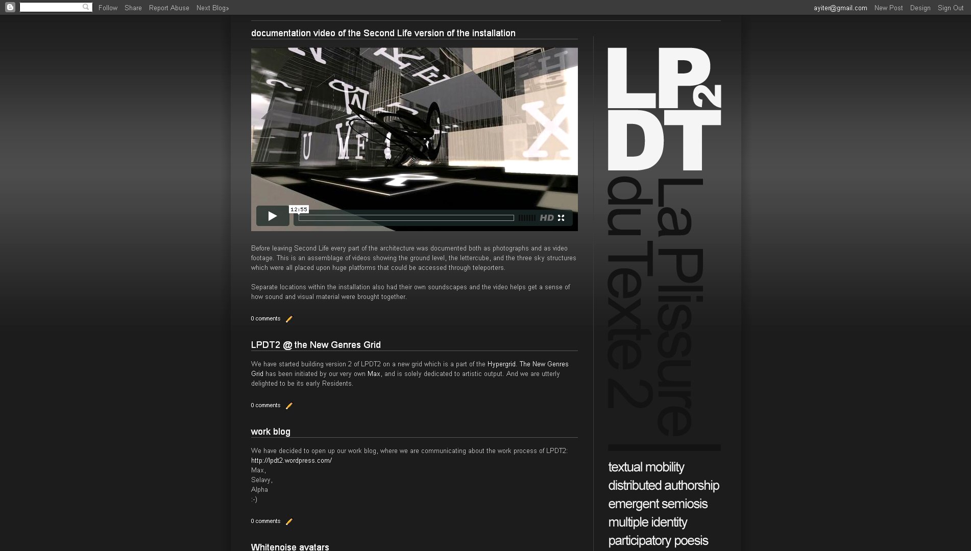
See the result here:

.................................................................................................................................

blogspot page bottom: customizing the pager, the footer, the subscriptions links, etc...

Again we have Furkan to thank for this really great information which deals with all of the elements on the bottom of a blogspot site:

To delete the "subscribe to posts (atom)" line find the line <b:include data='feedLinks' name='feedLinksBody'/> inside the HTML code, and simply delete it.

To remove the attribution gadget (that is the "powered by blogger" line), find /* Footer, and to the end of this section add the line display:none;

(Note:  I am not sure if removing the attribution gadget is something that Blogspot takes very kindly to. There may even be legal issues involved with doing so. So be careful with this one, I would say!)

And now the really cool part: Customizing the pager, which is the section where you have the links which lead you home, to older posts and to newer posts! You can change the default link text with anything that you wish and you can even replace it with images.


Above you can see how I customized the bottom area of the shoezznutzz site with little arrows pointing left, right and upwards on the pager and by removing the subscription link. On his own site Furkan used the shark on his header which he converted into an arrow. Brilliant!

The code for doing all this is somewhat lengthy, so I am going to direct you to Furkan's post about this here >>>, or...

Find this part in your code:

<b:includable id='nextprev'>
<div class='blog-pager' id='blog-pager'>
<b:if cond='data:newerPageUrl'>
<span id='blog-pager-newer-link'>
<a class='blog-pager-newer-link' expr:href='data:newerPageUrl' expr:id='data:widget.instanceId + "_blog-pager-newer-link"' expr:title='data:newerPageTitle'><data:newerPageTitle/></a>
</span>
</b:if>


<b:if cond='data:olderPageUrl'>
<span id='blog-pager-older-link'>
<a class='blog-pager-older-link' expr:href='data:olderPageUrl' expr:id='data:widget.instanceId + "_blog-pager-older-link"' expr:title='data:olderPageTitle'><data:olderPageTitle/></a>
</span>
</b:if>


<b:if cond='data:blog.homepageUrl != data:blog.url'>
<a class='home-link' expr:href='data:blog.homepageUrl'><data:homeMsg/></a>
<b:else/>
<b:if cond='data:newerPageUrl'>
<a class='home-link' expr:href='data:blog.homepageUrl'><data:homeMsg/></a>
</b:if>
</b:if>
</div>

Now, if you want to change the text, just delete these underlined parts and write you own text.
If you want to put an image source, delete them, put this: <img src="Image URL" />

.................................................................................................................................

blogspot stuff: removing the top navigation bar

Very simple, if you know where to look, which our ingenious student Furkan obviously did: Go to the HTML editor and find this bit of code: ]]> Before this snippet put #navbar { display: none; }


Furkan tried it and as you can see it works perfectly!

I tried it too and the only fly in the ointment which I can see with this is that it makes one lose the quick access to the design button on the right hand side of the bar. I guess one could keep the design editor open in a separate tab or something. 

Thank you again Furkan and keep the good stuff coming please. Much appreciated!

................................................................................................................................

is becoming a designer a matter of "talent"?

No, it is not, I would say.

What has brought on this post is that one of my students (a non-design major) has just let me know that she is dropping out of the class. It is the 9th week of the semester and it is her last chance to do so. Her reason is that she doesn't think that she has the talent for the job. I have tried to reason with her, however to no avail. She firmly believes that being able to put together a good website needs a special sort of talent, which she doesn't think that she has. Taking the class has made her realize that, she says.

Of course it does take what one might call a special talent if we are talking about the high end of design work: High powered art directors, visionary designers and typographers - these people do have a special something going for them, obviously. That said, anyone who has common sense, a sense of order and hierarchy, who takes the time to look at the design output of others and examines what they see critically, can develop a sense of good design. Or put differently, anyone who can put visual elements together into one continuous whole (which is something that most of us manage to pull off every morning when we get dressed) can become a competent designer.

Maybe not so before the days of the computer and the abundance of resources that it has brought to our doorstep. Back in the bad old days (which I am actually old enough to remember very well ;-), before all else you did need the ability to draw. Which, as far as I am concerned, is not exactly a talent either but a skill.

Common sense - that is what this is mostly about folks. And resourcefulness! Not some undefinable something that goes under the name of talent! Having a sense of huge enjoyment whilst making the stuff. Getting excitement out of finding a resource that will help solve a visual problem. And then getting a real kick out of the satisfaction of the problem solved. Those would be the basic prerequisites, in my book. Once those are in place, "talent" will follow - and much sooner than you think! :-)

.................................................................................................................................

blogspot post customization code snippets

Some things that I could think of (and found the code for at various places) that all relate to modifying the appearance of your posts. All sorts of things from post and post title background colors, to post title icons, to initials. This is a long and somewhat messy looking post, so I am going to ask you to very kindly take a little jump break and... :-)

Whatever is marked up in black is what you will need to change. Remember that you can do most of the stuff that applies to the entire blog (and not just a single post) in the Custom CSS box of the advanced tab of the template designer. This will allow you to see your changes as you tweak the code:

Changing the background color and padding of a single post:
Place this line inside the HTML tab of the post editor, in the beginning, add your text, close with the slashed div tag:
<div style="background:#your hex value; padding:Xpx;">
Your text goes here....
</div>

Changing the background image of a single post
Place this line inside the HTML tab of the post editor, in the beginning, add your text, close with the slashed div tag:
<div style="background:url(URL of your picture) no-repeat;">
Your text goes here....
</div>
(Note: If you have an image which you would like to repeat, just change the word "no-repeat" to "repeat", or you can also remove the whole thing from the code altogether).

Centering the post title on the whole blog:
The code for this will vary from template to template, however what you need to do is this: Find the line which says h3.post-title in the HTML editor. Then place text-align:center; underneath that line and just above the }

Adding a small icon before the post title on the whole blog:
Find the first line of code below in the HTML editor, then add the second line, with your image URL:
<b:if cond='data:post.url'>
<a expr:href='data:post.url'><img src="Your image URL" style="border-width:0px"/><data:post.title/></a>
<b:else/>
<data:post.title/>
</b:if>

(Note: You can also place the icon in different locations, above and below or to the right of your post title. Read more about this here:

Adding a picture to the background of post titles on the whole blog
Find the first line of the below code in the HTML editor, then play with all the values highlighted in black:
h3.post-title {
background: url(URL of your picture); background-repeat:no-repeat;
height:Xpx;
margin:.Xem 0 0;
padding:Xpx Xpx Xpx;
font-size:X%;
font-weight:normal;
line-height:Xem;
color:$titlecolor;
}

Adding color to the background and borders of post titles on the whole blog
Find the first line, then play with the values highlighted in black:
h3.post-title {
background:#your hex code;
border:Xpx inset #your hex code;
margin:Xem 0 0;
padding:Xpx Xpx Xpx;
font-size:X%;
font-weight:normal;
line-height:Xem;
color:$titlecolor;
}

And if you want your post title to be underlined (like I did on this blog) use this line in the code above:
border-bottom:Xpx solid #your hex code;

Getting big dropcaps initials/or a big first letter in a single post
Go to the HTML tab in the post editor and place this code around the letter that you wish to have drop, play with the stuff highlighted in black:
<span style="float:left;color:#000000;font-size:Xpx;
line-height:Xpx;padding-top:Xpx;font-family: Times, serif, Georgia;">your letter</span>


This one below for the initial you wish to go upwards:
<span style="font-family:Georgia,;color:#000000;
font-size:Xpx;font-weight:X;line-height:X%;letter-spacing:Xpx;">your letter</span>


All that I can think of for now folks. Maybe more will follow at some point... ;-)

.................................................................................................................................

using the blogspot text widget (and the post editor) to make menus and thumbnail galleries

On the right hand column of this site you can see a section where I have put a menu with thumbnails for template downloads. It just occurred to me that I never got round to posting on this little trick which I figured out and which makes it very easy to make something like this by using the text widget and the regular post editor. Here's how it goes:

1) Start a regular post - except do not publish it but save it as a draft! (You can always go back and add to it later as well if you just keep the draft).

2) Put all your images and text in the post. (Your text will wrap automatically, however remember that your images will need to be sized to the width of the sidebar that you are planning to put the widget into).

3) I guess you could also add a background texture/color, or a border, or a bit of padding while you are still doing the post entry, as explained here >>>. I haven't tried this myself yet, but I am assuming that all of these attributes would show up on the text widget as well.

4) Select all the stuff on the HTML tab of the post editor and copy.

5) Start a new text widget, go to the HTML tab, then paste the code you got from the post editor into there.

6) Save! Done!

.................................................................................................................................

finally! a good looking flickr widget!


If, like me, you have a flickr feed you will be wanting to show it on your blog. There are quite a few flickr widgets around, except that most of them look horrible enough to make you want to run as far away from them as you can, getting you stuck with nasty looking backgrounds and borders and huge big type.

Just stumbled upon one on Flickr itself which actually lets you modify the layout in such a way that you can get rid of all the text, backgrounds, borders, buddy icons and whatever else and only show photos of your choosing. The whole stream, or a set, or a group... And at perfectly decent sizes at that! And if you want to you can get this as a flash thingy also - although that one seemd a tad too small thumbnailwise. And yes, they actually give you the code, so you could modify this even further should you wish to do so - but why bother really? Looks decent enough to me as it is.

Note: I made the screenshot above on the dummy easy peasy site, which currently has a very dark background. The thumbnails float on whatever your background may be, so do not be misled by that.

Check it out here:

.................................................................................................................................

moving the header image in blogspot

I could beat myself up! All that time I spent trying to align header images! And it never even occurred to me that there might be a really simple way of doing it (or rather of polishing things off). Well, there is, and this is it:

#header img {
margin-top: 0px;
margin-left: 0px;
}

Paste the above code into the CSS box on the Advanced Template Editor, play with the values highlighted in black - and watch things move!

Not that this will save you the initial design work that needs to be undertaken in the image editor, obviously. To get a really good clean look you will still need to align the blog columns and the header elements in the way in which I described it here. However, all that done, you may (and probably will!) need to tweak things still further once back inside the HTML environment. And that would be the point where this code snippet will prove its weight in gold!

.................................................................................................................................

finding the broken URL's on your site

If you have a big site with many pages, especially one with lots of images that you have linked to externally (or just a lot of regular links for that matter), it may end up becoming very difficult to keep track of whether everything is still in working order.

The free application below, developed by a very nice gentleman named Tilman Hausherr, does a scan which took about 5 minutes to complete for my HVC site, which has a huge number of links at this point. Found 2 missing images and one broken text URL. Of course, I had no idea that they were even gone! Very impressive!

Download, install and run to see how well you are doing with your URL's:

.................................................................................................................................

blogspot stuff: how to make your blog wider than 1000 pixels

Look for the first line of the following code inside the HTML editor and play with the values highlighted in black:

<b:template-skin>
      <b:variable default='930px' name='content.width' type='length' value='1000px'/>
      <b:variable default='0' name='main.column.left.width' type='length' value='0px'/>
      <b:variable default='360px' name='main.column.right.width' type='length' value='402px'/>

That's it!

Not that this would be a recommended thing for most sites, of course. However, if you want to do something of an artistic nature, which only folk with high screen sizes could see in full - this would be how, I guess... ;-)

.................................................................................................................................

search engine optimization: pingy

I have been noticing on the easy peasy stats page that we seem to be getting quite a few visits from something called pingy. So, I just checked it out and this looks like a pretty neat service to help hike up your site visitor figures. Check it out here:
http://pingymasspingtool.blogspot.com/

.................................................................................................................................

blogspot template modification - shoezznutzz


http://shoeznutz.blogspot.com/

I indulged my love of weird shoes in order to make another template modification. ;-)

There isn't too much to tell with this one except that I like the menu on the bottom and worked quite a bit on getting that to sit right. The header text was created in photoshop, using layer styles. Although I am usually somewhat careful when it comes to colored typography, in this case it seemed to be a good choice since the site background and the design are both toned down enough for colored text to make a good contrast.

Something which has really added to the design here is the post recommendations widget which I was posting about a few days ago. And another thing which I put in here is a custom cursor, which I got from the free cursor site, which I posted about before here.

This one too started out from the picture window template, in this case the first one on the left. I just wanted to try something very simple and minimal to show the images. So, I changed the radius values and the background image URL's from the HTML editor, played around with fonts, type sizes, colors etc and that was pretty much it, outside of adding a border to the images. For which again, I used the CSS box on the Advanced Template Designer to put in this bit of code:

.post-body img {
padding: 12px;
background-color: #151515;
border: 1px solid $(image.border.color;
}

Download template and header visuals from here >>>

.................................................................................................................................

blogspot template modification - istanbul catz and dogs


http://istanbulcatz.blogspot.com/

A Flickr contact of mine named István Tóth takes the most wonderful Istanbul cat and dog photos. With his consent, I have now started a blog for them. Partly to provide tutorial material for the easy peasy page, but mainly because it is so much fun to do it! (great content = easy design, remember? ;-)

For this one I used the picture window template, the one in the middle with the red header. What I was looking for was something like the rounded rectangle background that goes underneath everything, including the header. Nice unification of design elements, that. The radiuses of the rectangle's corners were smaller than what I have here, so I looked for the word "radius" inside the HTML code and changed the values. Also, I replaced all of the background png files with my own stuff by doing a ctrl+F in the HTML editor for "png". Then as usual, I went to the Advanced Template Designer and changed the fonts, colors, etc from there.

Another thing which I used here is the code which Furkan found on Southern Speakers a few days ago, which allows you to have separate boxes for things you post on the same day.

There is one thing with this blog, which is that it is bi-lingual. Which means that in the posts I would like to somehow distinguish between Turkish and English. So, the English stuff gets some added code inside the HTML tab of the post editor. Nothing major - only one small line:

<span class="Apple-style-span" style="font-family: 'Times New Roman'; font-size: 17px; line-height: 1.8em;">english text</span>

The widgets got a custom treatment: They got a special shape, became wider, got a background color, etc. All of which I did from the CSS tab on the Advanced section of the Template Designer. And here is the code which I used for that, which you will need to apply to all the new widgets that you create:

#Gadget ID{
margin-top:20px;
margin-right:-15px;
margin-left:-5px;
padding: 15px;
background:#222222;
font-family:Arial;
font-style: normal;
font-size:13px;
text-align:left;
color: #888888;
border-radius: 20px;
}

I also added a border to the post images, again with the same CSS tab. And the code for that is this one, obviously you can change padding and color values as needed:

.post-body img {
  padding: 6px;
  background-color: #975858;
  border: 1px solid $(image.border.color;

There is a custom cursor on this as well. Those who would rather not have this will need to go into the code and remove the line which says
<style type='text/css'>body, a, a:hover {cursor: url(http://cur.cursors-4u.net/cursors/cur-7/cur671.cur), progress;}</style> 
and which comes just before
<b:skin><![CDATA[/*

And finally the header - where I tried something new: I placed the cat image (which is actually a part of the header) on the upper right hand corner in such a way that the header takes a curve around the post column. This was positioned as a separate image gadget, whose location I played around with using the CSS tab on the advanced designer. You can use your own image to replace what I have on the site. Create an image with a transparent background, save as a 24 bit png file and upload into the picture gadget.

The code for the placement of this is below, and please note how the margin values are huge big negative ones. This allows me to position the transparent png image above the header text, as well as the post, as a layer. Great! And I will certainly be experimenting with this feature a whole lot more:

#Image1{
margin-top:-100px;
margin-left:-44px;
}

And as for the header text, this was made with a layer style, however turned out to be way too strong in terms of color in the end. So, after I was sure of where everything was supposed to go, I merged the layers and colorized/desaturated the whole thing with the HSL palette and then saved this as a 24 bit PNG file with transparency.

Download template and photoshop file for the header here >>>

.................................................................................................................................

web image formats

There seems to have been some confusion amongst you about this. So, just a very quick post on which ones to use and when:

GIF: Will only use up to 256 colors when saving, so this works best for solid colored things (preferably with aliased edges) that have few colors and no gradients. You can also have transparency with GIF, however it will hardly ever look right, will give you some very nasty jagged outlines unless you are using it on straight edged shapes such as bitmap fonts.

JPEG: The one which you will probably end up using the most, works very well with all types of images, in that it uses millions of colors when saving - except that there is no transparency.

PNG: There are two types to this  - PNG8 and PNG24. Avoid 8 like the plague! Use GIF instead, works the same way, with only 256 colors. The one to go for is PNG24, which is a fabulous image format that also works with millions of colors + transparency. So, you cannot go wrong with this. Downside: Will create large file sizes when used on large, complex textured images, in which case JPEG is a much better option.

.................................................................................................................................

blogspot: separate boxes and timestamps for posts that were created on the same day

This is something which is much needed indeed! Furkan has spotted the solution at Southern Speakers where it is all explained very clearly here:

Thank you Furkan!

Southern Speakers seems to be hard to reach at times, so I am also copy pasting the code onto here. However, this is a really long bit of code, so to see it please take a jump break and

Find the first line of this code in the HTML editor:
<!-- posts -->
<div class='blog-posts hfeed'>
<b:include data='top' name='status-message'/>
<data:defaultAdStart/>
    <b:loop values='data:posts' var='post'>
      <b:if cond='data:post.isDateStart'>
        <b:if cond='data:post.isFirstPost == &quot;false&quot;'>
          &lt;/div&gt;&lt;/div&gt;
        </b:if>
      </b:if>
      <b:if cond='data:post.isDateStart'>
        &lt;div class=&quot;date-outer&quot;&gt;
      </b:if>
      <b:if cond='data:post.dateHeader'>
        <h2 class='date-header'><span><data:post.dateHeader/></span></h2>
      </b:if>
      <b:if cond='data:post.isDateStart'>
        &lt;div class=&quot;date-posts&quot;&gt;
      </b:if>
      <div class='post-outer'>
      <b:include data='post' name='post'/>
      <b:if cond='data:blog.pageType == &quot;static_page&quot;'>
        <b:include data='post' name='comments'/>
      </b:if>
      <b:if cond='data:blog.pageType == &quot;item&quot;'>
        <b:include data='post' name='comments'/>
      </b:if>
      </div>
      <b:if cond='data:post.includeAd'>
        <b:if cond='data:post.isFirstPost'>
          <data:defaultAdEnd/>
        <b:else/>
          <data:adEnd/>
        </b:if>
        <div class='inline-ad'>
          <data:adCode/>
        </div>
        <data:adStart/>
      </b:if>
      <b:if cond='data:post.trackLatency'>
        <data:post.latencyJs/>
      </b:if>
    </b:loop>
    <b:if cond='data:numPosts != 0'>
      &lt;/div&gt;&lt;/div&gt;
    </b:if>
    <data:adEnd/>
  </div>

Select the code and very carefully scroll all the way to the end, making sure you do not miss anything or select anything extra. Then delete all of what you selected and insert this instead:
<!-- posts -->
<div class='blog-posts hfeed'>
<b:include data='top' name='status-message'/> 
 <data:defaultAdStart/>
 <b:loop values='data:posts' var='post'>
  <div class="date-outer">
   <h2 class='date-header'><span><data:post.timestamp/></span></h2>
   <div class="date-posts">
    <div class='post-outer'>
     <b:include data='post' name='post'/>
     <b:if cond='data:blog.pageType == "static_page"'>
     <b:include data='post' name='comments'/>
     </b:if>
     <b:if cond='data:blog.pageType == "item"'>
     <b:include data='post' name='comments'/>
     </b:if>
    </div>
    <b:if cond='data:post.includeAd'>
     <b:if cond='data:post.isFirstPost'>
     <data:defaultAdEnd/>
     <b:else/>
     <data:adEnd/>
     </b:if>
      <div class='inline-ad'>
       <data:adCode/>
      </div>
      <data:adStart/>
    </b:if>
    <b:if cond='data:post.trackLatency'>
     <data:post.latencyJs/>
    </b:if>
   </div>
  </div>
 </b:loop>
 <data:adEnd/>
</div>
.................................................................................................................................

blogspot stuff: this (too) is "awesome inc"

I seem to notice in class that you are not really pushing the limits of the templates as much as you should. These templates are a fabulous start out point, however left in their default state they will hardly be adequate to suit any sort of ambitious design criteria. They are not even meant to do so - they are meant to be modified! And, as far as I can see, very few of you are modifying them to the extent where they will really suit your needs.

So, I have decided to do a few examples for you. Here is the first one: My visual communication history blog was long overdue for an overhaul, so it will be a good one to work on for this.


As visual material I have modified an earlier photoshop file, so nothing new there. I did make some new header typography for it, however. Which I may still change, not entirely happy with it yet... 

The template that I have used is one of the subcategories of awesome inc, and as a matter of fact it is that particularly nasty looking pink one with the white band underneath the header. So, yes, it did take quite a bit of work to get this to look the way that I wanted it to look.

What I did want out of this was a semi transparent background for the widget area. To get rid of all the white stuff I went into the code and replaced the image file which they had used with my own image file, a tiny 16 x 16 pixel semi transparent dark gray 24 bit png file, which I had previously uploaded to Picasa.  (Tip:  just do a ctrl+F for "http" and you will find all of it, since it is one linked image which has been used several times. And after that it is just a matter of replacing it with yours  ).

Next thing was adjusting all of the line heights. Which meant pasting this code into the CSS box all the way on the bottom on the advanced tab of the template editor. This is a really great thing (almost as good as the split window in Dreamweaver), since you can see the changes take effect as you are tweaking. The parameters you need to play with are highlighted in black:

#PopularPosts1 li{
line-height: 140%;
}
.post-body {
line-height: 1.7;
}
li{
line-height: 140%;
}

And then finally, all the other colors, etc, were fixed in the advanced editor as well. And, now I have a brand new look on my blog! See it in action here:
http://visualcommunicationhistory.blogspot.com/

You can also download the template from here >>>

.................................................................................................................................

linkwithin - post recommendation widget + beautiful design!


Caution: Beautiful as this is, it does not serve the same function as the one that was posted before. That one gives you ratings as well as recommendations. This one here only recommends, doesn't let people rate the posts.

http://www.linkwithin.com/learn?ref=widget

.................................................................................................................................

fine line between good web design & usability

As the technology advances, we get more and more freedom in how we design our websites. While this aspect allows creativity beyond imagination, it also creates dangerous pitfalls that should be avoided. First, you have to accept and understand that you are designing a web-page not a print (poster etc.), which is the most dangerous pitfall for beginner web designers especially for those with a graphic design background. (GripLimited; welcome to poster design 101, great typography but a ton of problems). Then, you have to think like a simple internet user, where will they look, what will they see, can they reach the desired information easily. Know that, not everyone will be as proficient as you are with internet browsing, nor will be able to see your website like you see it.

During the design process, there are mainly 5 issues that you have to be careful with. These are visual placement, visibility\accessibility, navigation, loading times\problems, categorizing\archiving (if used).

Below, I will try to give you some examples of what "NOT" to do. The selected sites are particularly well designed however due to one of the facts above, each suffers major problems in usability.

Visual Placement - or in this case Visual Mess:

This is what I would like to call hammering the visitor. I don't even understand what the page is about, nor where I should click.

Nicely done, but what am I looking at? There is so much going on, stuff moving on its own. It is impossible to understand what is a link and what isn't. A navigation disaster as well. Plus on smaller screens, it re-sizes itself, I can't even imagine browsing this site on a netbook.

Visibility\Accessiblity - or in this case Invisibility:

Incredibly fun and innovative design, yet an overkill due to the ridiculously big design. It gets tiresome to drag yourself around, not knowing what is where.

Innovative design and yet again too large for its own good, it is hard to understand what and where is content. Plus the site scrolls from bottom to top and the scroll is at the right bottom. Also too much content at one page, it takes quite long to load.

Navigation - how will I browse?:

Where to begin? This site is a lesson by itself. Disturbingly long load time, no proper menu (just a bunch of images that bring out names that don't mean anything). Slow and jagged transitions on images. Again more load times for new pages. And marvelously, you have to go to a new page to actually shut off the sound.

There was on thing that wasn't on Toyota's mind while designing this beautiful website, navigation. It is really unsatisfying going over those numbers on the bottom to actually see where they might be linked to.

Loading Times - lets face it, no one will care how beautiful your page is if it takes more than a minute or 2 to load. This is especially a problem with those who tend to use flash. In HTML, the only thing you have to be careful about is the size of the images you use. If you are crating a page with massive and high quality images, try to use pre-loading and loading screen javascripts to prevent partially and slowly appearing images. Even in this case, there is the same problem with flash, if you overdo it, it will take disturbingly long:

Along with no proper navigation, it also takes quite a while to load. Add to this, the fact that there is no way whatsoever of skipping the introduction animation and you get a beautiful and yet useless website.

Categorizing & Archiving - you have to create an intuitive interface so that the visitor can find what he/she is looking for easily... or maybe you don't as in the following cases:

This is the pillar of confusing categorization. Just click one of those stripes and see what happens, how could anyone find what they are looking for over there.

Another very confusing categorization, just move your mouse pointer to the right side of the page and you will see.

Finally...
I hope this gives you a good perspective on what to consider when designing for web. Good and innovative design is very important but overdoing it results in losing visitors which I guess no one would want.

.................................................................................................................................

the trio: padding - border - margin

The most common and confused elements of the css.

Border: As the name suggest it is the border around your element. If the border has 0 width, the border edge is the same as the padding edge and invisible.

Padding: Defines the space between border and element content. If the padding has 0 width, the padding edge is the same as the content edge. This means that your content will stick to the edge of your defined content box.

Margin: Defines the space between border (if you don't have a border then padding, and if you don't have a padding then content)  and other surrounding elements. If the margin has 0 width, the margin edge is the same as the border edge(if you don't have a border then padding, and if you don't have a padding then content).

Each edge of margin, padding and border may be broken down into a top, right, bottom, and left edge. (for ex: padding-right: , margin-left: , border-bottom: etc.)

The image below may give you a better understanding.


.................................................................................................................................

CSS position attribute

Position is the most vital component in web design and thus it deserves a separate post of its own. It tells your elements where and how they will be positioned in the flow of the page.

There are basically four different positioning properties that are available.

Static: The default property. You don't need to specify this unless you want to enforce a change on your element which receives a different position property from a parent element that is out of your control. Static does not do anything, it practically places the element into the flow of the page in the order it is written in the HTML.

Absolute: Like the name suggest, it is the most overwhelming positioning property. When you choose position:absolute, you have to specify the position by using attributes such as left: , right: , top: , bottom: (not all of them are necessary, use just the ones you will need). These will position your element according to the next parent element, if there are no other parent elements then it will take top-left corner as the reference point.

Beware while using absolute positioning, as powerful as it is, its improper use will restrict the flexibility of your page. As the absolute positioning removes your elements from the flow of the page, they will no longer be in interaction with the other elements of the page. They will rather become stand-alone elements that don't get effected by where other elements are.

Relative: The most commonly used positioning property. When used properly it is the most effective tool that opens up a bunch of powerful opportunities. However it is also the property that gets used improperly most of the time, leading to various problems.

It is confusing because when you say relative, people tend to think that it is relative to some other element, whereas it actually means relative to itself. Let me explain this with a simple example. Say you give an element position:relative; and no other attribute. In this case, you will have your element placed in the flow of your page just as it would have been in static. However when you start giving it attributes such as left: , top: , then you will have your element's position shifting relative to where it should have been.

With the relative property you also gain the chance to use z-index attribute, which is a very powerful attribute. It allows you to place elements on top of each other, the element with the higher z-index will always show up on top. There is a catch though, if you have a static element in that area, it will always be at the bottom even if you specify a z-index. this is something you have to plan beforehand.

Fixed: The rarest property among all four. It certainly has its uses, but has to be thoroughly tested because it has proven to be one of the most problematic on different screen resolutions.
This property positions the element relative to the browser window. When you scroll a page the browser window doesn't change thus your element will stay where it is no matter what, it will practically scroll with your page.

The most popular uses of this property are having a non-scrolling background image, having your header always stick up to the top of the window and having your footer always stick to the bottom of the window. Sometimes it is also used to keep sidebar navigation in view at all times as well, though this is highly unrecommended. Also do never use this for content area elements unless you have an overwhelmingly creative idea.

Bonus Tip: Relative+Absolute: If you have a parent element that has relative position, you can create a child element to it and then absolute position it inside that relatively positioned element.

If you want to delve into the topic more and get a good grasp of the uses, I recommend you to read this 10 Step Guide which explains the uses very clearly.

.................................................................................................................................