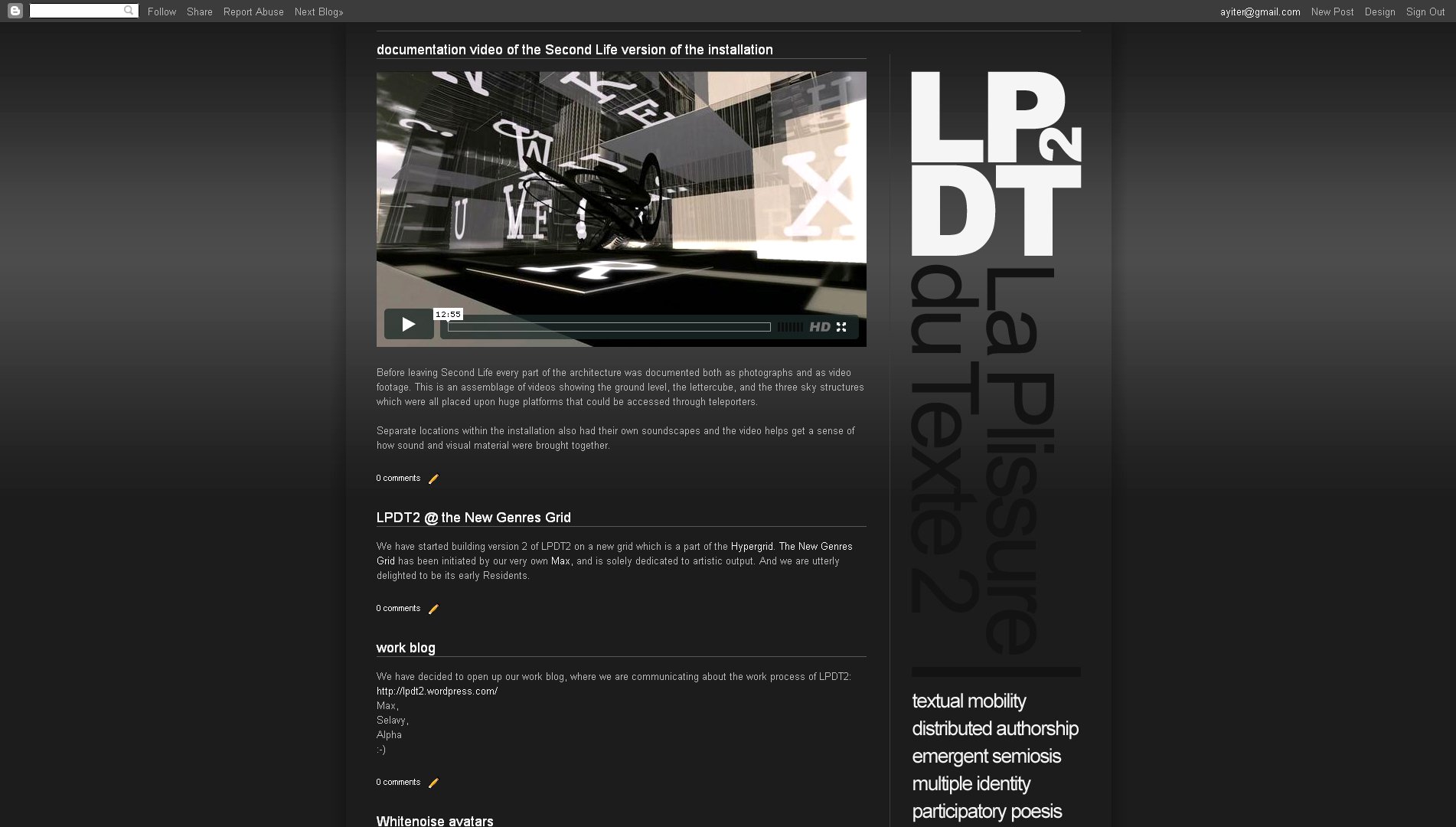
design: making a vertical header


I have been meaning to try this out for quite some time, for a number of reasons: First off, it does get kind of boring to always have horizontal headers at the top of a website: The way in which a website is constructed vertical elements such as the columns do look very good. So, why not use the vertical components of the layout for design strategies, as well as a place for info elements such as labels and link lists?

And then also, web real estate: If you have the content starting all the way at the top of the page, you will be showing considerably more at first sight - obviously.

I just made a website for an art project in which I am involved, and since the logotype of this is a square which works well when placed on a corner with the site description "dropping down" from it (so to speak), this seemed a very good opportunity to give the idea a shot.

Remember that before all else you will need to unlock the header widget! To find out how this is done read this post here >>>.

The template which I used is the one which I took from this site, except that I changed the layout and the number of columns, as well as their widths and proportions, so that the vertical header fit into the corner without looking cramped in. Needless to say the whole thing took a bit of aligning, which these days I do quite quickly by playing with the margin values, as is explained here >>>

See the result here:

.................................................................................................................................

blogspot page bottom: customizing the pager, the footer, the subscriptions links, etc...

Again we have Furkan to thank for this really great information which deals with all of the elements on the bottom of a blogspot site:

To delete the "subscribe to posts (atom)" line find the line <b:include data='feedLinks' name='feedLinksBody'/> inside the HTML code, and simply delete it.

To remove the attribution gadget (that is the "powered by blogger" line), find /* Footer, and to the end of this section add the line display:none;

(Note:  I am not sure if removing the attribution gadget is something that Blogspot takes very kindly to. There may even be legal issues involved with doing so. So be careful with this one, I would say!)

And now the really cool part: Customizing the pager, which is the section where you have the links which lead you home, to older posts and to newer posts! You can change the default link text with anything that you wish and you can even replace it with images.


Above you can see how I customized the bottom area of the shoezznutzz site with little arrows pointing left, right and upwards on the pager and by removing the subscription link. On his own site Furkan used the shark on his header which he converted into an arrow. Brilliant!

The code for doing all this is somewhat lengthy, so I am going to direct you to Furkan's post about this here >>>, or...

Find this part in your code:

<b:includable id='nextprev'>
<div class='blog-pager' id='blog-pager'>
<b:if cond='data:newerPageUrl'>
<span id='blog-pager-newer-link'>
<a class='blog-pager-newer-link' expr:href='data:newerPageUrl' expr:id='data:widget.instanceId + "_blog-pager-newer-link"' expr:title='data:newerPageTitle'><data:newerPageTitle/></a>
</span>
</b:if>


<b:if cond='data:olderPageUrl'>
<span id='blog-pager-older-link'>
<a class='blog-pager-older-link' expr:href='data:olderPageUrl' expr:id='data:widget.instanceId + "_blog-pager-older-link"' expr:title='data:olderPageTitle'><data:olderPageTitle/></a>
</span>
</b:if>


<b:if cond='data:blog.homepageUrl != data:blog.url'>
<a class='home-link' expr:href='data:blog.homepageUrl'><data:homeMsg/></a>
<b:else/>
<b:if cond='data:newerPageUrl'>
<a class='home-link' expr:href='data:blog.homepageUrl'><data:homeMsg/></a>
</b:if>
</b:if>
</div>

Now, if you want to change the text, just delete these underlined parts and write you own text.
If you want to put an image source, delete them, put this: <img src="Image URL" />

.................................................................................................................................

blogspot stuff: removing the top navigation bar

Very simple, if you know where to look, which our ingenious student Furkan obviously did: Go to the HTML editor and find this bit of code: ]]> Before this snippet put #navbar { display: none; }


Furkan tried it and as you can see it works perfectly!

I tried it too and the only fly in the ointment which I can see with this is that it makes one lose the quick access to the design button on the right hand side of the bar. I guess one could keep the design editor open in a separate tab or something. 

Thank you again Furkan and keep the good stuff coming please. Much appreciated!

................................................................................................................................

is becoming a designer a matter of "talent"?

No, it is not, I would say.

What has brought on this post is that one of my students (a non-design major) has just let me know that she is dropping out of the class. It is the 9th week of the semester and it is her last chance to do so. Her reason is that she doesn't think that she has the talent for the job. I have tried to reason with her, however to no avail. She firmly believes that being able to put together a good website needs a special sort of talent, which she doesn't think that she has. Taking the class has made her realize that, she says.

Of course it does take what one might call a special talent if we are talking about the high end of design work: High powered art directors, visionary designers and typographers - these people do have a special something going for them, obviously. That said, anyone who has common sense, a sense of order and hierarchy, who takes the time to look at the design output of others and examines what they see critically, can develop a sense of good design. Or put differently, anyone who can put visual elements together into one continuous whole (which is something that most of us manage to pull off every morning when we get dressed) can become a competent designer.

Maybe not so before the days of the computer and the abundance of resources that it has brought to our doorstep. Back in the bad old days (which I am actually old enough to remember very well ;-), before all else you did need the ability to draw. Which, as far as I am concerned, is not exactly a talent either but a skill.

Common sense - that is what this is mostly about folks. And resourcefulness! Not some undefinable something that goes under the name of talent! Having a sense of huge enjoyment whilst making the stuff. Getting excitement out of finding a resource that will help solve a visual problem. And then getting a real kick out of the satisfaction of the problem solved. Those would be the basic prerequisites, in my book. Once those are in place, "talent" will follow - and much sooner than you think! :-)

.................................................................................................................................

blogspot post customization code snippets

Some things that I could think of (and found the code for at various places) that all relate to modifying the appearance of your posts. All sorts of things from post and post title background colors, to post title icons, to initials. This is a long and somewhat messy looking post, so I am going to ask you to very kindly take a little jump break and... :-)

Whatever is marked up in black is what you will need to change. Remember that you can do most of the stuff that applies to the entire blog (and not just a single post) in the Custom CSS box of the advanced tab of the template designer. This will allow you to see your changes as you tweak the code:

Changing the background color and padding of a single post:
Place this line inside the HTML tab of the post editor, in the beginning, add your text, close with the slashed div tag:
<div style="background:#your hex value; padding:Xpx;">
Your text goes here....
</div>

Changing the background image of a single post
Place this line inside the HTML tab of the post editor, in the beginning, add your text, close with the slashed div tag:
<div style="background:url(URL of your picture) no-repeat;">
Your text goes here....
</div>
(Note: If you have an image which you would like to repeat, just change the word "no-repeat" to "repeat", or you can also remove the whole thing from the code altogether).

Centering the post title on the whole blog:
The code for this will vary from template to template, however what you need to do is this: Find the line which says h3.post-title in the HTML editor. Then place text-align:center; underneath that line and just above the }

Adding a small icon before the post title on the whole blog:
Find the first line of code below in the HTML editor, then add the second line, with your image URL:
<b:if cond='data:post.url'>
<a expr:href='data:post.url'><img src="Your image URL" style="border-width:0px"/><data:post.title/></a>
<b:else/>
<data:post.title/>
</b:if>

(Note: You can also place the icon in different locations, above and below or to the right of your post title. Read more about this here:

Adding a picture to the background of post titles on the whole blog
Find the first line of the below code in the HTML editor, then play with all the values highlighted in black:
h3.post-title {
background: url(URL of your picture); background-repeat:no-repeat;
height:Xpx;
margin:.Xem 0 0;
padding:Xpx Xpx Xpx;
font-size:X%;
font-weight:normal;
line-height:Xem;
color:$titlecolor;
}

Adding color to the background and borders of post titles on the whole blog
Find the first line, then play with the values highlighted in black:
h3.post-title {
background:#your hex code;
border:Xpx inset #your hex code;
margin:Xem 0 0;
padding:Xpx Xpx Xpx;
font-size:X%;
font-weight:normal;
line-height:Xem;
color:$titlecolor;
}

And if you want your post title to be underlined (like I did on this blog) use this line in the code above:
border-bottom:Xpx solid #your hex code;

Getting big dropcaps initials/or a big first letter in a single post
Go to the HTML tab in the post editor and place this code around the letter that you wish to have drop, play with the stuff highlighted in black:
<span style="float:left;color:#000000;font-size:Xpx;
line-height:Xpx;padding-top:Xpx;font-family: Times, serif, Georgia;">your letter</span>


This one below for the initial you wish to go upwards:
<span style="font-family:Georgia,;color:#000000;
font-size:Xpx;font-weight:X;line-height:X%;letter-spacing:Xpx;">your letter</span>


All that I can think of for now folks. Maybe more will follow at some point... ;-)

.................................................................................................................................