aligning the top of your columns in blogspot

You may already have noticed that the top of the post column at blogspot stands a few pixels above the gadget columns, and if you are like me you are probably dying to fix that. Yesterday in class I was delighted to find out that our student Furkan is bothered by this as well, so this post is especially for him :-).

Funnily enough the blog section at blogspot is perceived as yet another widget by the code! Which Selim most ingeniously figured out - one smart cookie, that one! So, you actually need to go to the bottom of the widgets section of the CSS in the HTML editor, where you will see this line, which is the start of the next section:
* /Posts
----------------------------------------------- */

Then add this code directly above that line, while you are still inside the widgets section, that is:
#Blog1{
margin-top: 6px;
}

Then play with the pixel value highlighted in black until all the stuff is aligned. In the case of this page this was 6 pixels, could be less or more in yours, of course.

.................................................................................................................................

playing with blogspot widgets (gadgets)

As we have talked in the class last week, it is possible to separately edit every widget, give them different backgrounds, alignments, borders, colors, fonts etc. Here is how you do it:

The "widget id" is the only thing you need to edit the widget, but first you need to find it of course. To find the ID of the gadget you wish to modify, please read this previous post here.

Now go into the HTML editor, into the CSS part and find the section entitled "Widgets", then scroll down to the end of the section, just above the part where "Posts" section starts. In other words search for this line:
* /Posts
----------------------------------------------- */
And then all you have to do is; add the code given below straight above this line. The word Label1 in the topmost line, which is highlighted in black, is what you replace with the ID that you have found in the way described in the above linked post.

#Label1{
margin-top:20px
padding-left: 5px;
background:#ddddd;
font-family:arial, sans-serif;
font-size:11px;
text-align:left;
color: #db4c46;
};

The styles I have used are just for example, you can use as many or as few as you wish.

.................................................................................................................................

backgrounds: one size fits all

Here is what to do if you want to have a background image that will automatically re-size itself according to the browser windows size (thus also for different screen resolutions).

First off be sure to get a nice large image around 16:9 ratio size having preferably 1900 px width, reduce its size (not in pixels, as in kbs) so it is not larger than 300-450 kbs(even this is too large but it will do).

Then upload it to someplace where you can have a direct link to it.

Finally go into "Edit HTML" from the design tab. Find "body {" in the css section. (just searching that quote without the quotes will get you there if you can't see it). It will most likely look something like this:

body {
  font: $(body.font);
  color: $(body.text.color);
  background: $(body.background);
}

Now, replace this part;
background: $(body.background);
with this;
background: url(http://www.yoururl.com/your_image.jpg) no-repeat center center fixed;
-webkit-background-size: cover;
-moz-background-size: cover;
-o-background-size: cover;
background-size: cover;

You should have something like this as the final result;
body {
  font: $(body.font);
  color: $(body.text.color);
  background: url(http://www.yoururl.com/your_image.jpg) no-repeat center center fixed;
  -webkit-background-size: cover;
  -moz-background-size: cover;
  -o-background-size: cover;
  background-size: cover;
}

This will work in most of the latest versions of known browsers.

.................................................................................................................................

splashup - another great online image editor


Beautiful dark, elegant interface. Makes one feel good just to look at it. You can edit and save images from and to various online domains, including Flickr and Facebook, as well as from and to your own hard drive, of course. And it seems to have quite a few of the necessary bells and whistles - such as layers, layer effects, filters and so forth...

Check it out here: http://www.splashup.com/

.................................................................................................................................

design tutorial: clean body text in your posts

I have made some deliberately unaligned body text and taken several snapshots which I combined for a tutorial. Looks really ugly folks! :-P:


To get to the tutorial, please click on the image and read the annotations.

.................................................................................................................................

playing around with photoshop layer styles


I downloaded the styles mostly from 22 pixels, however I may have looked elsewhere too. Just pull in a whole bunch and put them in the styles folder under photoshop presets. Then click on the little right arrow at the top of the styles palette in photoshop to load them. And my advice is to leave their values more or less as they are. It is quite easy to lose the effect altogether if you start tweaking them too much. I used the vector shape tool and I also installed a few dingbat fonts since layer styles seem to work especially nicely with shapes. (The two circle arrows on the right are in fact dingbats).

Only other thing I did was that I added a little divider line between the menu items. A tiny little vertical 1 pixel grey stroke and then gave that a motion blur at 90 degrees exactly, so that it faded out at both ends.

And the photoshop file, where you can also see how I aligned the stuff, is here:

.................................................................................................................................

blogspot stuff: finding your gadget ID


This is something which you need to know about if you wish to configure the properties of your individual gadgets in the HTML editor. They are well hidden out of sight, however can be found at the very end of the address bar of the gadget when you are on the Design panel: Click to edit the gadget, scroll all the way to the right, to where the mouse cursor on the image is pointing - and there it is!

.................................................................................................................................

easy peasy downloads

Wandering around the internet, gathering learning material for my students, I am touched by the amount of resources people make available to others. So, in my modest way, I would like to contribute as well - especially given the fact that I am making such a big point of using the resources and material of others as part of a web learning strategy:

Whenever I make a full photoshop file (or anything else that is remotely usable) for my own class I will be giving a download link to it as well. The very first one is in the previous post and they will all be collected under a new label called "downloads". My students will have the good sense to not to use the content "as is" for their course work, since I will obviously be able to recognize my own handiwork quite easily. Others who come to this site - please feel free to use as you see fit. A linkback would be very nice of course, but I will not be insisting upon it...
:-)

.................................................................................................................................

being "resource-ful": site layout with ready made visual components


Read all about it here ;-)

Get the photoshop file here:
http://www.citrinitas.com/easy-peasy/geek-folk.zip

.................................................................................................................................

chaoscope: a great application to create website backgrounds

Download and play! :-D


http://www.chaoscope.org/

 (Tip:   Start out with the stuff from the projects folder and take it from there. Pick different fractal formula from the very top of the panel. Choose different render modes. Drag your cursor to rotate the fractal. F3 makes a new shape, F4 renders it for you. Also remember to click on the gradients at the bottom to get random color schemes. 

.................................................................................................................................

no more bands underneath your top gadgets in blogspot

And following closely, is another really good one from SouthernSpeakers:

Unfortunately it isn't only your pages gadget! Any gadget you place up at the top of your page seems to get this nasty old band underneath it. To get rid of them once and for all, simply go to Design > Template Designer > Advanced > Add CSS and paste the following code: 

.tabs-outer {
  background: none !important;
}
.tabs-cap-top, .tabs-cap-bottom {
  border-top: none;
}

Then press enter after the last character of the last line } (after the last curly bracket, in other words). Apply to Blog. Done!
Thank you SouthernSpeakers! Awesome!
__________________________________

And here is Onur's addition: The page that he has directed us to tells us to do one of two things with the following text. You can either go to the Template Editor > Advanced > Add CSS. Or you can go directly to the HTML editor and look for ]]></b:skin> and paste it right before that line.

So, here is the code if you want to center your pages:

.PageList {text-align:center !important;}
.PageList li {display:inline !important; float:none !important;}

If you want the pages to align right however, then this is it:

.PageList {text-align:right !important;}
.PageList li {display:inline !important; float:none !important;}

If the tabs stack on each other after you added the code, replace display:inline with display:inline-block.

 ( Note:   And be sure to catch the little fullstops at the beginning of every line of the code. Very easy to miss, so be extra careful!  ) 

.................................................................................................................................

how to stop your pages gadget stretching all the way across your blogspot site

The fact that this happens is one of the reasons why I have not been using this gadget since it breaks up your page in a really nasty way. Here is how to fix it:

Go to Design > HTML editor. Find the line which says
/* Headings ----------------------------------------------- */

Then, paste the following code directly above it:
/*--Pages Gadget No-Stretch Starts--*/
.tabs-outer {
background: transparent !important;
}
.cap-top, .cap-bottom{
border: none !important;
}
.tabs-inner .widget li a{
border: none !important;
border-right: 1px solid $(tabs.border.color) !important;
}
#crosscol{
background: $(tabs.background.color) $(tabs.background.gradient);
border: 1px solid $(tabs.border.color) !important;
}
/*--Pages Gadget No-Stretch Ends--*/

Comes to us from SouthernSpeakers, a great site for all sorts of blogspot codes. Lots more there, definitely check them out!

.................................................................................................................................

seo: post title before blog title, or how to get google to like your blogspot site even more

Here is another little code snippet which will make it possible for a search engine to search the contents of your posts as well as your blog's title and keywords. Result: Even better web visibility. All you need to do is find this line in your HTML code under the 'Design' tab:
<title><data:blog.pageTitle/></title> 
And then replace it with this:
<b:include data='blog' name='all-head-content'/>
    <b:if cond='data:blog.pageType == &quot;index&quot;'>
<title><data:blog.pageTitle/></title>
<b:else/>
<title><data:blog.pageName/> ~ <data:blog.title/></title>
</b:if>
Save. Done!

 (Tip:  It will of course help if there is some indication in your post title as to what you will be talking about. As an example, a title such as "nice code" would not have gotten me very far with this one right here. So, as you can see, I made a point of mentioning all the relevant stuff in the post title itself.  ;-) 

.................................................................................................................................

nice clean search box

I don't know about others, but I was hugely bothered by the way the default search gadget looks on blogspot - the way the 'search' button shoulders its way into the actual search area and then all that 'powered by google' stuff below...

So, here is the code for a squeaky clean one, no buttons, no nothing, just a plain empty entry field. And as is usually the case - "less is more" once again! Simply copy/paste this code into an HTML/Javascript gadget. Change the value highlighted in red to get the correct width and you are all set to go:

<form action="/search" id="searchthis" method="get" style="display: inline;"><input id="search-box" name="q" size="18" type="text" /></form>

.................................................................................................................................

how to get google to like you

Want to get a top ranking in search engines? Be sure to have proper meta tags included in your html. Meta tags are not a magic trick to get you to become the top website on search engines, however they provide search engine crawlers with the desired information which proves that you deserve to be thereabout.

Definition & Usage (as explained on w3schools.com)
  • Metadata is information about data.
  • The <meta> tag provides metadata about the HTML document. Metadata will not be displayed on the page, but will be machine parsable.
  • Meta elements are typically used to specify page description, keywords, author of the document, last modified, and other metadata.
  • The <meta> tag always goes inside the head element.
Most Important Tags: (What you need to fill is highlighted in red)

identifier-url This tag provides google-bot with the information on where to start indexing your website.
[meta name="identifier-URL" content="http://www.yourwebsiteurl.com"]

description Provides the description of your website, you can use a maximum of 255 characters.
[META NAME="description" CONTENT="yourdescription"]

keywords Write a maximum of 12 keywords separated by commas, which are directly connected to your content.
[meta name="keywords" content="keyword1,keyword2,keyword3,keyword4,etc"]

language Provides the language of your website, if it is English, this is not very important but still it would be good to have. 
[META NAME="Language" CONTENT="english"]

revisit This tag is important for bloggers such as yourself and for those who update their sites very frequently, otherwise it is just a waste of space. It tells google-bot, how frequently it should visit your website. Having a short interval means, you will have updated content much faster on google search engines.
<meta name="revisit-after" CONTENT="X days" />


Other than these there are many more meta tags, however they do not have much of an impact. If you are interested you can see the whole lists here and here. Also you can use the online meta tag generator to get a proper code which than you can copy/paste into your website.

.................................................................................................................................

pixie CMS

Pixie, a "small, simple", user friendly, (and free!) HTML editor, again comes to us via four Yip, my Second Life colleague and brilliant Dutch artist and illustrator.

.................................................................................................................................

free icon editor

Nice little tool:
http://www.free-icon-editor.com/
:-)


.................................................................................................................................

clean typography for website headers


I am not sure that what is shown above even needs much further explanation.

Clean typography, plenty of space, the usage of one strong color together with a lot of neutral ones such as grays, black and white - and you are more or less home and dry.

There will of course be occasions when the content of your site will necessitate that you use a company logotype or some sort of extra visual indicator on what the site is all about. But even then clean solutions will usually work much better since a website gives you a very small area to work on and things will usually end up being be placed very close together to begin with; so wherever you can be clean and simple it is good practice to go for it.

One thing web designers make a lot of usage of however are all the stylistic details which they use to enhance their work, by giving it a dimensionality which makes elements stand out from the page. When you look at the ones above you will notice that there are very few where the design elements have been placed on the page "as is". They have been worked upon with bevels, drop shadows, delicate touches, soft gradients, ultra thin strokes, and so on. Never overboard, never exaggerated, never so that it becomes coarse but very very carefully - almost like as if these designers are jewelers, working very patiently on exquisite ornaments or watches. This is something that I would encourage you to do as well.

Getting the exact right balance for these types of details is not so easy however. A lot of them are created with the layer styles in photoshop, but all I can say is that whenever I try my hand at doing something like this I cannot pull it off. I rarely manage to get something that has this level of refinement. So, my advice would be to use pre-created layer styles. A good selection can be downloaded from WebTreats. And here are a few other good places also:

.................................................................................................................................

design tutorial: aligning a header

Alignment (and also deliberate non-alignment) is one of the foremost principles of good graphic design since alignment is how one of the fundamental Gestalt principles, continuity works. In the previous post we were looking at visual continuity and alignment is very much a part of that as well.

HTML web design is done in two places: One of them is an image editor and the other one is an HTML editor. And we need to be able to switch back and forth between them and also be able to carry values from one to the other. Meaning that we often need to make things work together although they are located in different places while we are still working on them. So, we need to be able to visualize how things will look, even at a point where we cannot yet see them together as a whole system.

In terms of alignment the good news is that on an HTML website most things are aligned by default since the underlying structure is based upon a table, very much like an excel sheet, in fact. (Only exceptions are the elements that are made out of images which you import into the cells - such as the header!).

When you design a website you will usually start out in an image editor and then adjust the alignment of the table cells in the HTML editor according to what you initially did in the image editor. However, you can also work in reverse and start out with the HTML editor and go back to the image editor from there. And the really good news is that the template editor at blogspot makes it exceptionally easy to do so.

So, go to the template editor and temporarily put a black (or white - depending upon your template colors) image on the background. All black or white - a tiny square which you tile. Then go to the blog title gadget in Design and delete everything. We want the top, the header area to be completely blank, in other words. Now take a snapshot of the site and then open it in the image editor.


Place guides at the edges of the gadget lines (or whatever it is that you have on your site that needs to be taken into account for alignment purposes), the post lines, the text columns. Anything that you see that you think will be important when aligning things. Now start putting in the design elements of your header, always keeping an eye on the guides.

Below I am showing you a few examples, both good and bad. In all of them you will see the text both with the guides and without them to help make things even clearer:


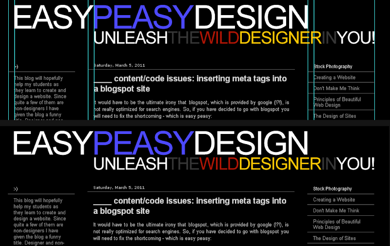
The first one is made up of two long sentences for title and sub title, where the top one is aligned to the text of the left hand gadget column and the lines of the right hand column. And then additionally the blue letter 'P' is also aligned to the post column. The sub title aligns to the lines of the right hand gadget column but also to the text of the post column. I have used the text column for the left hand side since this is a much stronger element than the thin lines. On the right however it is better to align to the lines since the text column there is ragged on the right hand side and doesn't give you much to go by.


In the second one I am keeping the title as it is but I am now making a little paragraph out of the sub title which I am aligning to the post column as well.


In the third one I am taking the sub title and aligning it to the vertical stroke of the 'D' of the word design. So, in this case I am no longer looking at the template but at the relationships within the header itself. Except - I still have an eye on the template guides since I would not want for the sub title to get placed without a good relationship to the guides either. In this case this would be all about getting not too close to them! The trick with alignment is that it is perfectly OK to be unaligned provided that you are really and truly unaligned! The death sentence comes when you are close but not exact. When your placement is "ambiguous" in other words. As the following example will show you:


Here the trouble is that the placement of the sub title is completely arbitrary, of course.


However sometimes things can go wrong even with the best of intentions. In this one I did not place the sub title arbitrarily, I actually aligned it to the stem of the letter 'Y' in the word 'Easy'. Problem is that I was not paying attention to the guides of the template and so I ended up being way too close to the post guides, which is the much stronger element.

 (Tip:  Always align things to the strongest element between two that are closely situated, never the weaker one!  ) 


In the final example I am showing you the sub title placed in such a way that it is no longer close to any of the guides or the vertical strokes of the letters. And this works too since I am making an unambiguous statement here. It is when you get caught in the middle that things will go to hell... :-)


And finally - once you are done, crop your image to the exact size, which will be your outer guides and upload as header image.

Even with all of this hard work, you may still end up not getting it completely right. In that case help is also at hand within blogspot: Copy paste the following code into the CSS box inside the Advanced tab of the Template Editor and play with the value highlighted in black:

#header img {
margin-left: 0px;
}

 (Also remember:  If you want floating elements and not a box, close the eye of the background and all unwanted layers before you save as a 24 bit png.  ) 

.................................................................................................................................

design: creating visual continuity

Time for a design tutorial now! ;-)

We shall be doing this by examining the structure and visual continuity of a professionally designed website template called 'boomerang 3D' from http://www.dreamtemplate.com/


HTML websites have a big advantage in terms of visual continuity since the structure of a site (header / menu / content) inherently provide for this. (Read more on website structure here).

When we design something we are actually creating a system. Not something that is good looking in its separate components but something that works together as a whole. So, when we are putting together visual elements we should not be making random decisions but always be thinking about whether the elements that we are deciding upon will work with everything else that we put next to them. There may be nice things that we see or think of, but if they do not serve the structure of the whole page we simply bookmark them for possible usage later, in some new project, but leave them alone for now since they will not work with the whole system.

In graphic design this system is made up of type, images, shapes and colors. And the usage all of these 4 components should be consistent. As an example, if you are using rounded rectangle shapes in the header of your page there should be rounded rectangles elsewhere as well - maybe buttons, or post backgrounds. Your typography should consist of a small selection of fonts that work well together and your type should always align in the same way. Your images should reflect a common color scheme (like they could all be black & white, or all color, or all colorized) and also how you crop an image may be quite important: If you sometimes crop images like squares and at other times like vertical rectangles and then sometimes as horizontal rectangles, it may well end up becoming visually inconsistent.

Now let us look at 'boomerang 3D' a bit more closely:


The obvious place to start out with any graphic design work is typography: In terms of graphical hierarchy type is always the number 1 element since it actually conveys the "spoken" information, which is of course the most important thing. Here the visual continuity in which type has been used is obvious - one font only, everything aligned flush left. Always a title above the images, with a sub-title to follow and then the body text below the image. And even when there is no image (such as on the 'contact us' page at the bottom), the same principle has been applied: Again title, closely followed by a subtitle, then an empty space - and then the actual body text. 

However although type is very important, one of the first things that strikes me when I look at this template is the way in which how all of the images have been cropped to form long narrow horizontal rectangles. This usage is possibly the most important continuous visual element and it adds hugely to the effectiveness of this site.

But here is the really clever thing which was done here: These narrow images are actually a sub-system, or a mini version of the larger system into which they are embedded. If you look carefully you will see that the whole layout consists of long, narrow, horizontal rectangles, starting from the green band in the header at the top, down to the long and narrow menu at the bottom. Even the form on the "contact us" page has long narrow entry fields instead of the usual chunky ones. And then there are long bands of darker gray that break up the layout horizontally as well. And almost nowhere do we see a strong vertical break - except in one place, the "about us" page where the left column is set wide enough and there is also sufficient space between the two columns for this to become quite unobtrusive.

One seeming inconsistency might be the fact that the green blur is much broader on the homepage than on the rest of the site. This has been done so that the homepage differentiates itself from the rest, of course. However, in the end there is no real inconsistency anyway since the relationship that is lost in the height of the shape is more than made up through a color which is powerful enough to pull this off.

And speaking of color - fairly self evident: They use one strong color together with lots of grays and always full color images.

Very clever! Very effective! Very elegant!

.................................................................................................................................

professional web templates: a lesson in good web design

It really is...

Dreamtemplate is one of the best and largest ones and it pays to look at their humongous selection of templates in order to get some good design inspirations. I have decided to use their templates for design tutorials  - one coming up in just a few minutes, in fact...

.................................................................................................................................

custom cursors

A friend of mine from Second Life, four Yip, has seen the easy peasy site and has given me a huge list of resources, of which I will be making good usage! Thank you four Yip :-) 

So, here is one of them: Would you like a custom cursor for your site?

Think carefully before you say yes. While some people (myself included) will love them, others may become highly irritated by them; especially since they will not be getting the little hand thingy for the links. That said, if the answer is still yes - here is a good place for them: http://www.cursors-4u.com/


Find the one which you think will work well with your overall design scheme and then copy the code from the little box underneath it where it says "universal CSS/HTML code for your web page".

Now comes the important part: Paste this code onto a text file first since you will need to do some serious cleaning up before you can put it into the HTML editor. Here is what the code will look like:

<style type="text/css">body, a, a:hover {cursor: url(http://cur.cursors-4u.net/others/oth-6/oth580.cur), progress;}</style><a href="http://www.cursors-4u.com/cursor/2011/02/16/sapphire-9.html" target="_blank" title="Sapphire"><img src="http://cursors-4u.com/support.gif" border="0" alt="Sapphire" style="position:absolute; top: 0px; right: 0px;" /></a>

Delete everything that is highlighted with red! Only keep the stuff that is highlighted with white, from <style type> to </style>, in other words. If you do not do this you will get a little "support Cursors4U" banner on your site. Which, in this case I find a bit excessive since Cursors4U seems to be doing quite nicely with lots of advertisements already.

Next step: Take the cleaned up code and paste it into the <head>, at the very bottom, just above the line which says <b:skin><![CDATA[/* and before </head>.

Done! You now have a custom cursor!

.................................................................................................................................

image tracking

Here it is folks:

This site lets the owner of an image find out where and how their images are being used. It also lets web designers locate the owner of a photograph to contact them about licensing. 

If you link back to an image by right clicking and copying the URL (inline linking), then you are OK, since the software would only track the image back to the original website. And in any case, there seems to be no plagiarism involved when you do inline linking as this article on wikipedia tells us.

However, if you download an image into your computer, play around with it a bit (resize, crop etc) and put it back online - then you are toast! Or could very easily be if the owner of the image were to set their mind on checking on things.

I am not sure if this would also work with highly processed and manipulated images, however I would err on the side of caution and stay away from such practices altogether. For one thing, regardless of whether you get caught or not, it is not the right thing to do. Second, why take the risk when there are literally millions of images online, which you can use under the proper creative commons licenses? Read more on where to find them here.

.................................................................................................................................

can you resize a full background image on an HTML/CSS website?...

... one of my students wanted to know last week. Well, seems that you can:
And you can see a demo of it in action here:

Apparently this works with just a few lines of code which you insert directly into the CSS:

#img.source-image {
width: 100%;
position: absolute;
top: 0;
left: 0;
}

Very very nice indeed! Lots and lots of other really cool code snippets (as they call them over there) to check out on their huge site. So, thank you Chris Coyier and CSS-Tricks!

 Note:  I have been thinking, and in order for this to give a good result your image aspect ratio would need to be 4 x 3 so that it reaches down effectively at sizes like 1024 x 768 or 1600 x 1200. However the width would need still need to be 1920 so that it also stretches to 1920 x 1080. Which makes the vertical value 1440. So, 1920 x 1440 is what you need. Which is pretty big and may be difficult to bring down to 300KB, which is the limit on blogspot background images. Read more on browser sizes and background images here  ) 

................................................................................................................................

"handwritten" fonts

I was going over my student's homework blogs and there seem to be quite a few of them who want to use handwritten fonts for post titles and headers. (Quite a few available on the blogspot template editor - ouch!).

Most graphic designers will probably agree that for the largest part handwritten fonts are problematic design elements. And the reason is pretty much right there in the word "handwritten". Well let's face it, they are not, are they? They are artificial constructions which try to imitate something that is quite impossible to imitate since it is so organically individuated.

When we write we follow a personal rhythm; so personal in fact that handwriting is considered to be forensic evidence, just like a fingerprint: We never ever duplicate the same exact shapes; the way we write individual letters depends entirely on the letters standing next to them - each one we shape, link up and place differently.

Handwritten fonts, on the other hand, link or place the (same shaped) "a" in exactly the same way, regardless of whether this "a" is standing next to a "t" or an "m" or an "r". And so what comes out, in most cases ends up looking rather phony, I'm afraid. There are lots of different handwritten fonts to choose from, of course - but not that many are well made enough to be able to get over this inherent limitation of being imitators. Flight (below) is one such good one, I think:


 Note:  And then there are also "script" or "calligraphic" fonts, which should not be confused with "handwritten" fonts at all. These fonts are based upon historic engraver's texts where each letter does in fact follow the same exact rules, is linked similarly, if not indeed identically to the ones standing next to it. So, these fonts usually do look very sleek and find very good usage within the proper context. Below are three nice ones which you can get from dafont.  ) 


.................................................................................................................................

playing around with (HTML) type

I haven't really been looking too carefully at the compose tab when I am entering a post, I guess. Just noticed now that (unlike wordpress) blogspot allows you to change the fonts and sizes of bits inside the text intuitively.

Great news! Means you can have custom designed block quotes on your posts, without having to write too much code! (The default block quote command does not look too clever since it pushes the text inside, so it is usually quite tough to get things correctly aligned with it).

Of course, one would need to be very careful when doing any of this because it might end up looking absolutely awful if you don't get it right. Still, I cannot resist and am trying one out right now. The body text on this blog is Arial so I will use Times New Roman to get a nice contrast between sans-serif and serif. Usually works very well - especially if serif is also set in italic:
______________________________

And now I will make this quite big, so that it really stands out from the body text.
______________________________

Since this is a special element, a strong color should be OK to use for type: So, I made this a dark blue for added accentuation. Now, I will go back to the regular font size/color and write some more, so that I have enough text to fill the post - a block quote needs a lot of text to nest inside properly. Notice that I also added lines to top and bottom to give it even more definition. While the body text is justified, the big text is flush left since at such a big size it would be very difficult to justify the type and not get "white rivers", which are the lines that run through and break up body text vertically. Very clumsy whenever that happens...

Although I started out on the compose tab I ended up tweaking the code in the HTML tab of the post editor quite a bit: Changed the font size from x-large to a pixel value, and also I changed the line height with an added <div> tag. So, here is what the code for this ended up looking like (the stuff that I added/tweaked is marked up in black):

<div style="line-height: 30px;"><i><span class="Apple-style-span" style="color: black; font-family: 'Times New Roman', serif; font-size: 38px;">And now I will make this quite big so that it really stands out from the body text.</span></i></div>

.................................................................................................................................

embedding a flash file (swf) into a blog post

You might need this for all sorts of things, but especially for stuff like flash based photo galleries. All explained beautifully, right here:
http://www.aleosoft.com/flashtutorial_blogger.html

.................................................................................................................................

well done Onur!

One of my students has just thrilled me by designing a really cool, minimalist homework blog. Only one post and one page so far, but already there are beautiful details, like the tiny bit of black highlighted text on the page, the typography/colors of the header, (a great color scheme on the whole site, by the way), a gorgeous favicon at the top...

I am well impressed:
http://onuroral.blogspot.com/p/about-this-blog.html
:-D

.................................................................................................................................

structure: having the best of both worlds?

Ahumm... All these pull-down menus and so forth... Very nice and everything, but let's face it, what use can they possibly be on a blogspot site unless you can have an infinite number of pages and nested sub-pages?

A regular website and a blog both have their shortcomings but also their advantages. Could there be a way to combine the advantages and minimize the shortcomings?


The two diagrams above show the way in which a blogspot site is set up (above), and the way a regular website is set up (below). On a blog the home page is a stream of posts going backwards in time (so the home page is in fact the main content); whereas on a regular website a home page is just a plain old home page from where you are expected to go to other pages, (in some cases, more or less immediately), to reach the actual content of the site.

Blogspot allows only for a limited number of pages and the navigation is mainly achieved through the labels, which I think are brilliant. The labels do not search inside the pages, only the posts. So, depending on how careful you are with labeling stuff, they work a bit like the categories in wordpress. Or, if you go totally overboard (I think you can have a maximum of 2000) they would correspond to a kind of a tagging system. But, one way or another, although the labels are very cool - they do not make up for the loss of the pages, and especially not the loss of nested pages, which are another thing that you cannot have on blogspot.


So, would there be a way to bring together the labeling system, the post stream on the home page of a blog and the unlimited number of sub-pages and nested pages on a regular website? I think there is, yes. You would simply need to set up a child blogspot domain which would have the same design as the mother domain and use the posts of the child domain as pages, as I am showing in the diagram above.

This allows you to keep the labels on your mother blog and you have an infinite number of pages and sub-pages (depending upon how you link things up) on the child blog.

 (Tip:  To transfer the design of one site to the other, download the full template from the mother site and re-upload it to the child site. Or, click inside the HTML editor (expand widget templates by checking the box first), do a ctrl+A to select the whole code. Then copy paste the stuff into the same location on the new site. Everything will appear as if by magic. Only exception is the header image - that will need to be uploaded again, I'm afraid.  ) 

What's more is that you could also diversify layout widths between the two sites in such a way that your "pages" could consist of a much wider entry column, since you would not have the labels on the child site. (Pages do not get labels to begin with, remember? ;-). So, you could go with only a 2 column layout or maybe even a single column one. 

I have actually already started putting this to the test with a child blog for this site to which I have already linked one post which I started here and then completed over there. The second easypeasydesign site has a single column layout since I want to show really big images sometimes inside the post. Which was in fact my main reason for starting the child site. However, the more I think about it, the better the possibilities seem to be with linked domains all working as one site.

It is of course highly likely that all of what I am talking about can also be achieved all on one site through coding. However, for folk like me, who would not be able to pull this off all too easily, my suggestion may still be a good one to work with.

Oh and - there is a glitch, which even a non-coder like myself would try to fix, which is that you wouldn't want the footer on the child site, where it says "older posts" and "home", since you would expect the "posts" to work like stand alone "pages". However, that I am fairly sure is something that can be fixed on the HTML editor by simply deleting that gadget altogether.

 Note:   The diagrams above were made with the open sourced yed graph editor, which you can download from here:
http://www.yworks.com/en/products_yed_about.html 

.................................................................................................................................

all kinds of menus

You can find some very nice custom menus at http://bloggerhowtotips.blogspot.com/


The image above shows you a selection from the available styles which you can generate on the site. On the left are vertical HTML/CSS menus and on the right are drop down vertical menus. Both pages give you the codes for all of the different design styles and also tell you exactly how to use them, which incidentally is through yet another HTML/CSS gadget - love these things!


And then there is also a smoothly animated multilevel drop down menu; again you can obtain the code for this from here, and again, this too works through the HTML/CSS gadget.

.............................................................................................................................

HTML codes for the ASCII

or simply put, how to get any symbol, letter etc. to show up properly on your website.

Writing simple blocks of text into your site is no problem at all, but what happens if you want to use symbols or letters such as; ¢, ¥, ¼, æ...

On some platforms such as Blogspot, you are in luck, you can open your character map or search the web for the symbol you want to use (which is a huge waste of time) copy/paste it and there it is. However you won't be so lucky if you decide to hard-code your website which will result in these symbols appearing jumbled up when you put them online. So here is the solution for both coders and those who don't want to waste precious time looking up the symbol.


Look up the symbol you want and copy either the html-name or html-number (both works) and paste it into your code to wherever you want it to be.

This next part is for those who will use it on Blogspot: While you are on the "New Post" or "Edit Post" Screen, where you have the title box and the text box, there are 2 options towards the top-right end of the text box; originally you always have Compose selected. Whenever you are going to paste one of these codes, select Edit HTML and paste it, then return to Compose and it should be there. You can keep on writing normally back in Compose and switch back and forth whenever you want.

.................................................................................................................................

ajax/javascript/flash image galleries

Here are some really good and popular image galleries that you can use in your web pages. All of them are free, however some do have Creative Commons licenses, so read carefully if you are thinking of monetizing your sites in future. All websites contain step by step tutorials on how to setup and customize the galleries, however most of them will require you to get your hands dirty, meaning you have to go into the code.

Ajax Galleries 
Lightbox (most popular, slick and cool design)

Javascript Galleries
Highslide (personal favorite, very customizable, probably requires the most coding among these)

Flash Galleries

Will be updated... Check back for more soon.

.................................................................................................................................